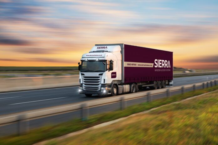
Sierra Windows has unveiled its new logo and refreshed visual identity across all platforms.
The updated branding is being rolled out across Sierra’s website, social media channels, vehicles, signage and marketing materials.
Kay McGrady, trade marketing manager at Sierra Windows, said: ”We are delighted to introduce our new branding, which reflects Sierra’s evolution as a business. As a leading trade fabricator, we are dedicated to providing innovative product solutions and exceptional customer service. This new visual identity reaffirms our commitment to excellence and positions us for continued success in the market.”
The decision to refresh Sierra’s branding was made after careful consideration, with a focus on maintaining the company’s core values of trust, quality and integrity. While the established colour palette has been retained for its symbolic representation, the typeface has been updated to give the logo a more modern and professional look.
Kay added: “We are proud of Sierra’s longstanding heritage and the reputation we have built over the years. This rebranding presents a refreshed and refined image to our customers and partners. We are still the same Sierra, dedicated to delivering excellence in everything we do.
“As a forward-thinking business, we felt it was the right time to refresh Sierra’s corporate image to reflect our present-day business ethos. We are delighted with the new, modern image that aligns with our innovative approach and commitment to excellence.”


